UX for Coffee Farmers
Prototype exploration for a mobile-first tool to help coffee farmers log work, track costs, and compare buyer offers.
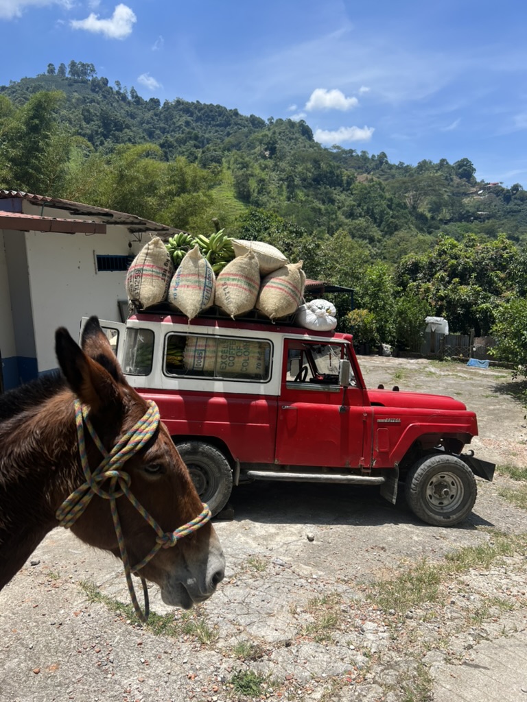
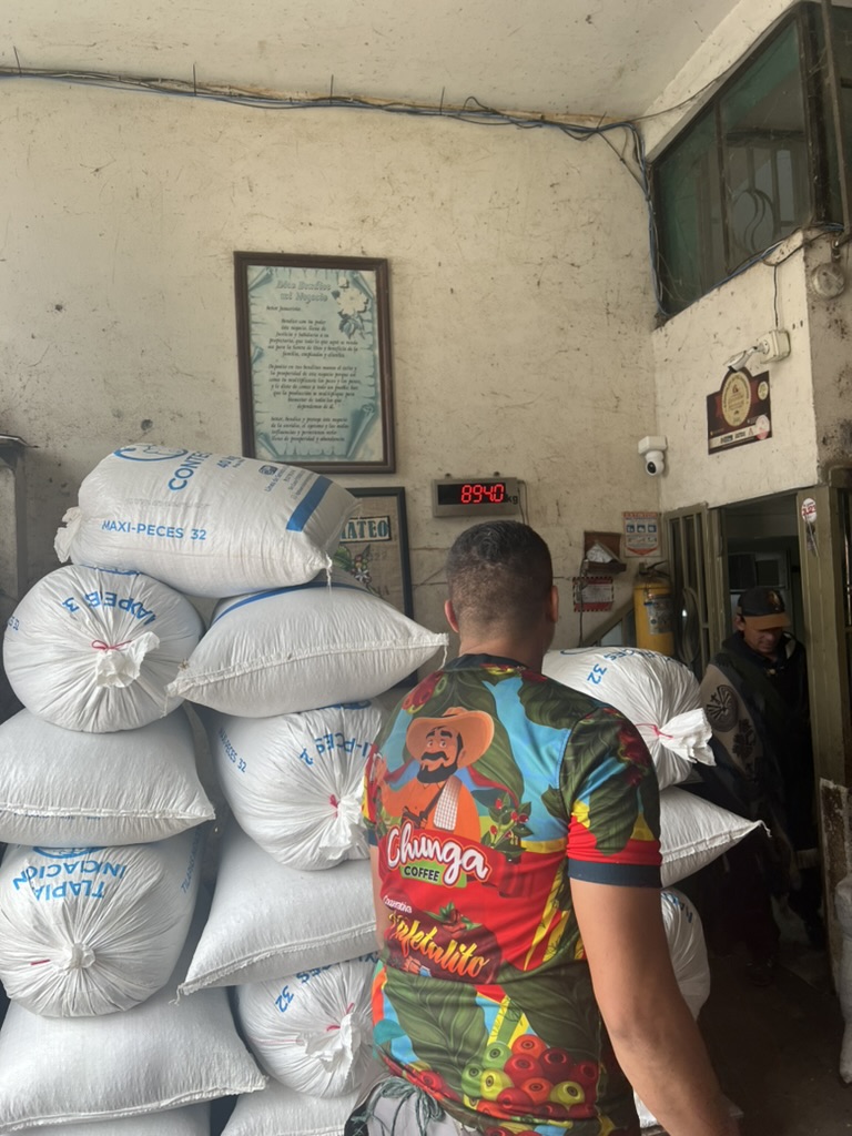
Over two years operating a coffee farm in Colombia, I handled production, crews, and buyer negotiations. Collaborating with a coffee buyer across Colombia and Guatemala broadened my view of both sides of the market. This self-directed project translates that experience into a prototype and a practical UX process.
The Problem
Many farmers rely on memory, notebooks, and WhatsApp to track crews, costs, and offers—making profit unclear and negotiations uneven.
What I Did
I ran Spanish-language interviews and quick reviews of low-fi flows with two farmers and one buyer to check wording, steps, and usefulness under real conditions.
Key Insight
Clarity builds confidence. When records felt trustworthy and easy to read, negotiations and daily decisions felt less risky.
Prototype
A clickable, mobile-first prototype focused on three tasks: logging contractor work, comparing buyer offers, and reading profit.
Overview — Why This Project Matters
Farmers need a reliable way to capture work, costs, and offers. This section sets the context and the guardrails that shaped every decision.
Role
Researcher & Designer
Timeline
Self-Directed (2022–2024)
Users
Coffee Farmers & Buyers
Focus
Research → Prototype → Test
What Was Needed
- Simple tools for daily logging and cost awareness
- Usable on shared, lower-end Android phones
- Fast flows for harvest days (minutes, not hours)
- Records that support confident negotiations
What Success Looked Like
- ~2-minute goal for daily contractor entry
- Clear "Compare Offers" view before selling
- Farmers can explain profit with example numbers
- Same data visible when discussing with buyers
Design Process
An overview of the steps I followed. Each card links to a deeper section below with embedded Figma frames.
Empathize
Interviews, personas, affinity maps, and journey mapping
Define
Problem statements, HMW framing, prioritization for first release
Ideate
Crazy 8s, concept sketches, idea mapping toward clear jobs
Prototype
Mobile wireframes, focused user flow, clickable demo
Test
Moderated sessions, observation notes, issue log
Iterate
Targeted updates to language, units, and recovery states
How the Loops Worked
Quick sketches → clickable frames → long conversational sessions → iterate. Each round focused on real tasks, captured wording issues, and prioritized fewer decisions per screen.
Real Tasks
Sessions focused on actual workflows: log crews, compare offers, read profit
Immediate Notes
Captured wording issues and extra steps to eliminate friction
Smart Priorities
Fewer decisions per screen over new features for better usability
01 · Empathize — Understanding User Needs
Working with local stakeholders, I led formal and informal interview sessions that surfaced how farmers actually log work, manage crews, and negotiate with buyers. Four insights shaped the first release: costs were logged inconsistently, labor coordination relied on memory, negotiation confidence hinged on trust, and technology had to respect low-connectivity conditions.
User Research Artifacts
Open in Figma↗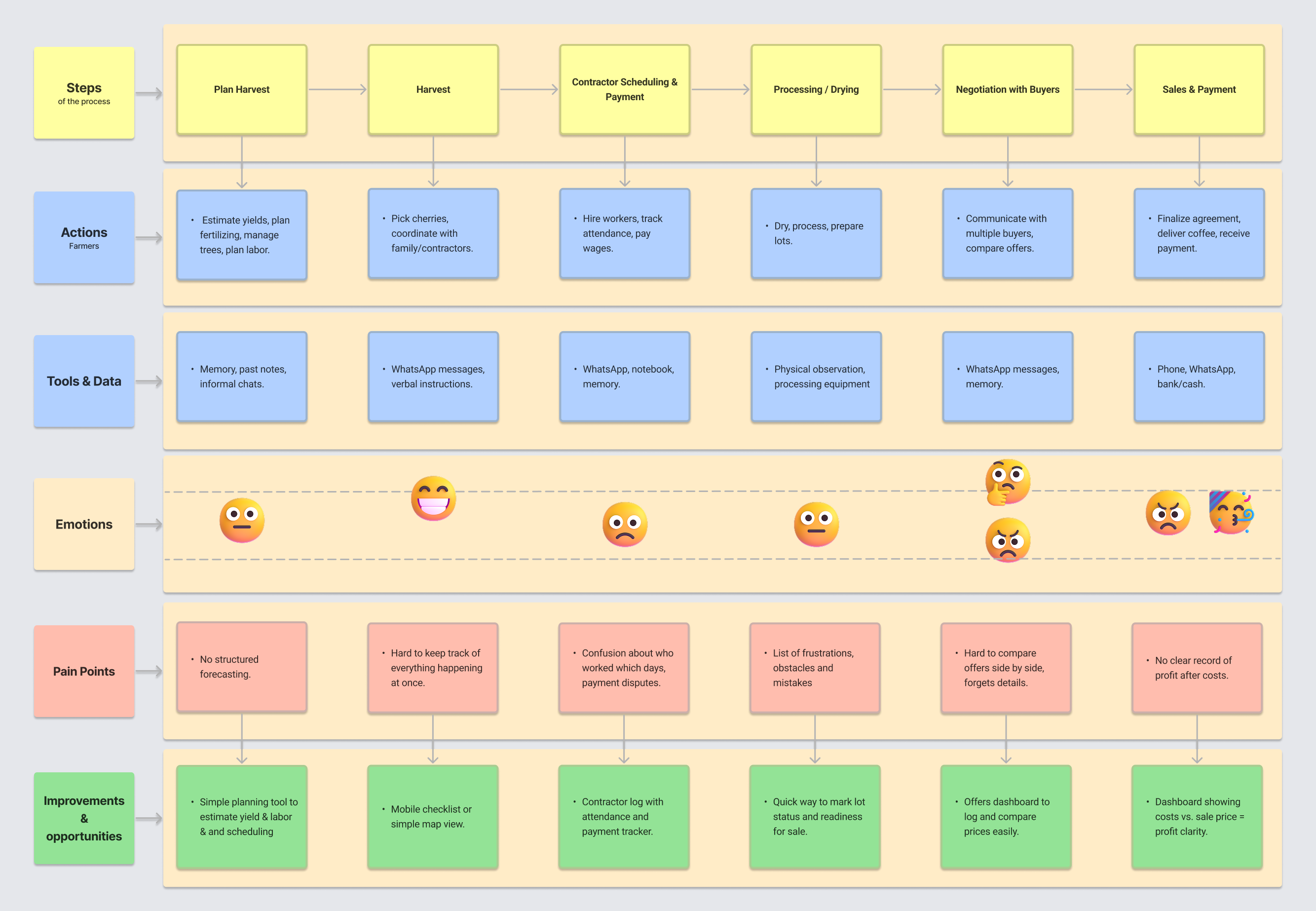
Key Findings
- Paper notes made profit hard to calculate, so decisions relied on recall.
- WhatsApp threads fragmented labor tracking and payment follow-up.
- Negotiations stumbled because records felt incomplete or unreliable.
Constraints
- Connectivity drops frequently; designs must work when signal is unavailable.
- Shared, low-end Android devices limit storage and speed.
- Harvest days leave minutes, not hours, for recordkeeping.
Research + Lived Experience
I drew on my own experience operating a farm in Pitalito and my time collaborating with a coffee buyer. These opportunities helped me conduct informal research sessions and use familiar terminology. The intent wasn’t to prove a solution, but to understand where simple tools could reduce effort.
02 · Define — Framing The Problems
Synthesis meant reconciling what farmers said with how work really happened. Goals sounded simple—log work, pay crews, sell fairly—but pressure, time, and mistrust made decisions fragile. The reframed challenge: rebuild confidence while keeping the experience simple.
Problem Definition
Open in Figma↗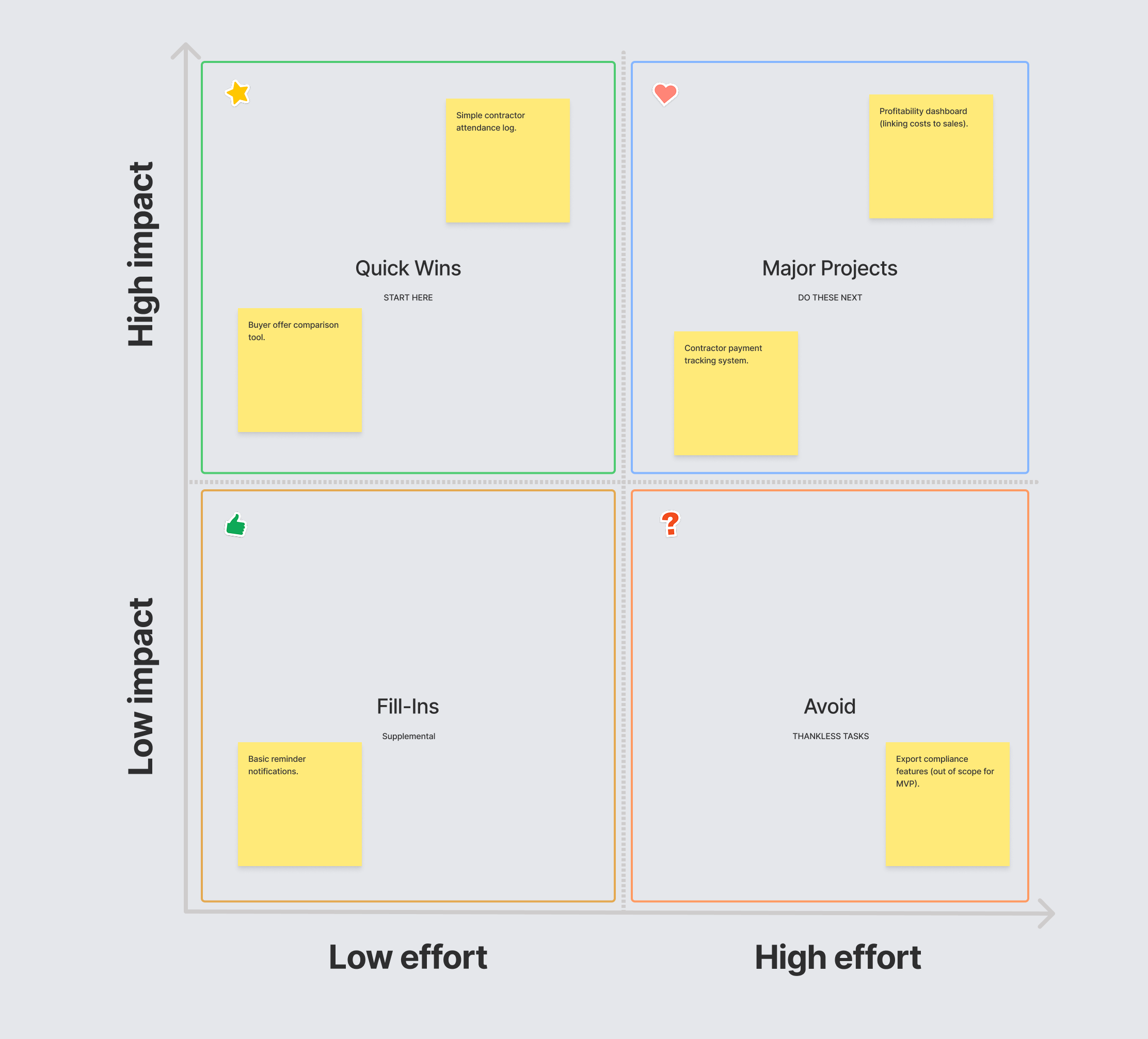
Validation goals
- Daily logging under two minutes—even during harvest.
- Trusted contractor totals for every pay-out.
- Clear, defensible profit snapshots before negotiating.
Representative HMWs
- How might we help farmers compare buyer offers quickly and confidently?
- How might we keep contractor payments trustworthy on a phone?
- How might we help buyers build long-term trust with farmers, despite negotiations feeling one-sided?
03 · Ideate — Generating Solutions
Ideation explored small, task-focused screens that fit into harvest routines. Early sketches and “Crazy 8s” helped explore flows and layouts: single‑purpose screens felt faster; wording mattered as much as layout; anything that slowed today’s work fell out quickly.
Ideation Artifacts
Open in Figma↗
Concepts
Contractor Log, Compare Offers, and Profit Snapshot
Trade-offs
Prioritized speed over feature volume; favoured flows that fit existing habits.
Decision
Focus on the trio of jobs that deliver confidence every day before layering on extra features.
04 · Prototype — Building to Learn
I kept the prototype simple and quick to try. Hand-drawn screens and paper flows let me test early without heavy investment, and the low-fi format kept feedback fast—focused on wording, steps, and expectations.
Prototype Artifacts
Open in Figma↗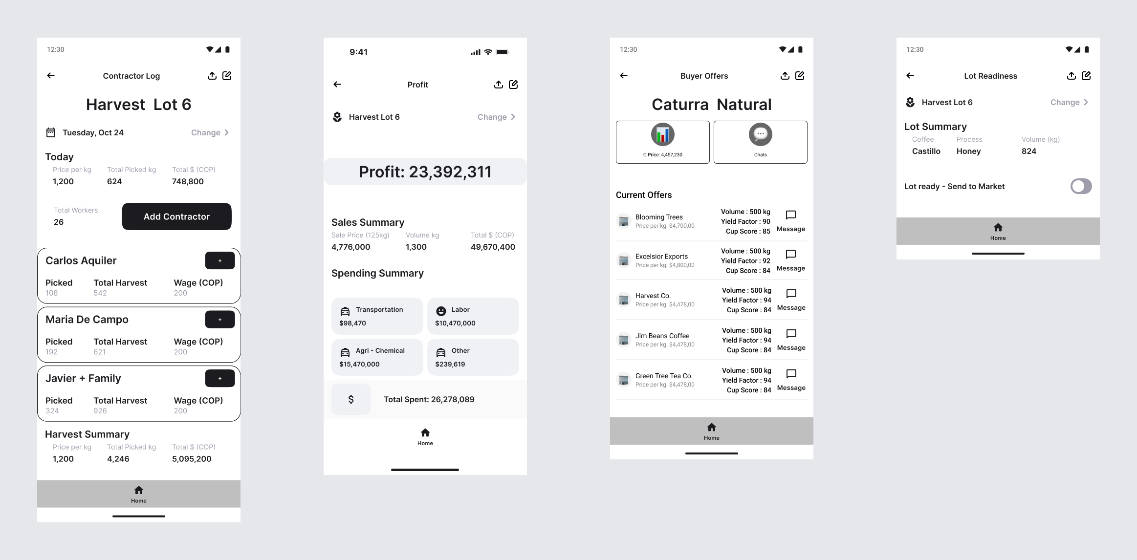
Collaboration With Stakeholders
- I co-sketched rough screens and paper flows with farmers so they could set priorities in real time—what to show first, what could wait, and which steps felt natural in their day.
- We used their words to shape labels and actions. Short, familiar phrases replaced jargon, and the flow changed where they hesitated or reached for WhatsApp habits.
- Farmers reacted to the changes, keeping what worked and cutting what didn’t—so the prototype direction stayed grounded in their input.
Technical Highlights
- Two payment models: Supports both per-kg and daily wage, with visible wage math (kg × COP/kg) and a daily salary path.
- Automatic rollups: Today’s totals, overall harvest, and estimated COP update live from a single source of truth (contractor state).
- Small, safe interactions: Undo isn’t implemented, but sensitive actions are gated in modals with clear labels and secondary “Cancelar” paths.
05 · Test — Learning From Users
Moderated sessions revealed that simple, single-purpose screens worked, but language, units, and transitions needed refinement. Confidence grew when people were able to view the information clearly.
Usability Testing
Open in Figma↗What I Learned Quickly
What Worked
- Single‑purpose screens mapped to daily tasks and felt quick.
- Large tap targets worked well outdoors (calloused hands, gloves).
- A small “Hoy” (Today) summary reduced back‑and‑forth.
What Needed Help
- “Ganancia” (Profit) was unclear without short examples.
- Unit switches (kg ↔ lb) created hesitation and errors.
- Save/sync status wasn’t obvious after actions.
Immediate Fixes
- Persist wage summary after contractor check‑out.
- Add brief helper examples for all profit inputs.
- Standardize on kilograms; show inline conversions if needed.
- Keep the Today summary visible across screens.
- Make save/sync status explicit (“Guardado local / Pendiente de sincronizar”).
Experience Improvements
- Make offline status impossible to miss.
- Make sync status impossible to miss.
- Add undo for check‑in/out and edits.
- Provide concise microcopy for money and units.
- Smooth transitions with brief “what happens next” text.
Cognitive Support
- Plain Spanish labels supported by simple icons.
- Examples and sensible defaults to reduce typing.
- Local currency formatting with immediate validation.
06 · Iterate — Refining The Experience
Iteration focused on clarity and confidence: surface summaries, simplify units, and narrate status. Every change traced back to a testing quote or metric so I could see progress.
Final Iterations
Open in Figma↗
Before → After (Contractor Log)
Wage summaries, Quick Add, and larger tap zones addressed checkout confusion and sped up payment steps.
Before → After (Compare Offers)
Side-by-side scoring and expandable details replaced unclear notes, making negotiations faster and more confident.
Before → After (Profit & Units)
Context-aware labels, COP formatting, and inline validation reduced errors and made totals easier to trust.
Iteration Priorities
- Fix words before changing widgets.
- Reduce steps before adding features.
- Make sync/saved status explicit everywhere.
- Offer undo for actions that touch money or jobs.
- Standardise units and currencies across every screen.
Key Learnings
Problem Framing & Scope
Narrowing the work to contractor logging, offer comparison, and profit clarity kept the prototype understandable, testable, and clearly valuable.
Language & Labels
The words farmers actually use reduced hesitation more than any layout change. In short tests, wording carried as much weight as structure.
Iteration & Evidence
Tying every change to an observed quote or data point made prioritisation straightforward and stakeholder conversations objective.
Designing for Reality
Shared devices, variable connectivity, and literacy levels shaped choices like single-purpose screens and explicit feedback. Constraints shaped the solution from the start.
Conclusion
This project is a grounded, self-directed exploration: translating lived experience and interviews into a modest prototype and a repeatable process. Rather than promise a perfect solution, the work focuses on clearer records and calmer decisions. If it moves forward, a small pilot with a few farms would test real-world savings and reliability under harvest pressure.
I'm open to sharing the file and co-testing with a small group to learn what truly helps and what doesn't.
Context & Potential Impact (Illustrative)
For Farmers
Time Saved Per Week
2–3 hours
Recovered Revenue
Illustrative 5–15% Annually
Confidence (Qualitative)
Confidence
Market Context
Colombian Coffee Farmers
540,000+
Small–Medium Producers
≈70% of Market
Mobile Access
Widespread in Rural Areas
Estimates for a typical 5-hectare farm earning $15k–25k USD annually. These figures are illustrative only; a pilot would be required to validate time saved and any revenue impact.